When I met with Lisa from Wax Republic I new we would hit it off immediately. She was in the final stages of launching a waxing boutique (www.waxrepublic.com) and had a very clear vision of what materials she wanted to produce for its opening. When someone has all their ducks in a row as much as Lisa did, I’m able to hit the ground running!
For the launch of the salon Lisa needed:
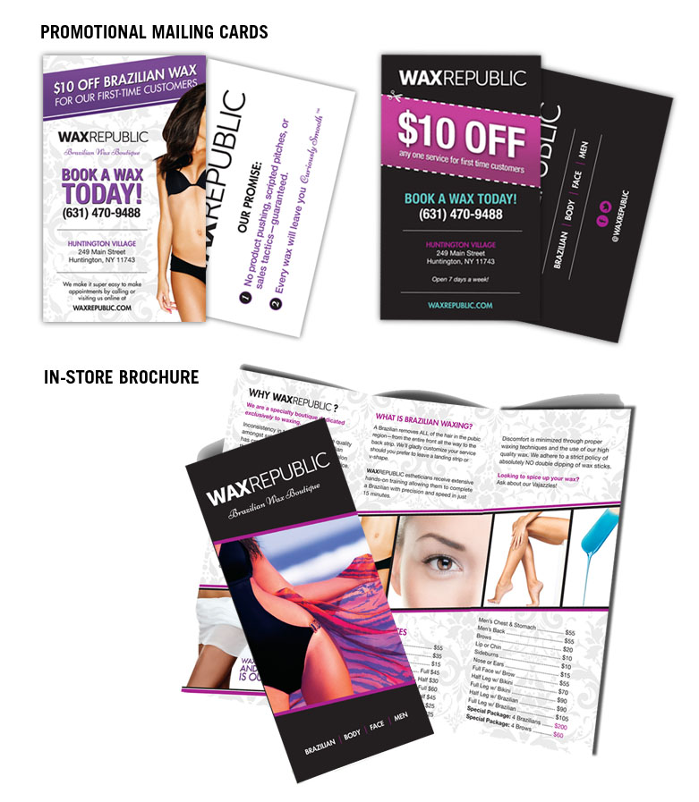
- In-store brochure
- Promotional cards (2 sets – offering special discounts and incentives for new customers)
- Social Media facelift (Visit them on Facebook and Twitter)
- Minor logo tweaks
- Email marketing images
Because the Wax Republic logo had already been created, these materials needed to reflect this already-established brand, as well as tie into the overall design of the salon itself (which Lisa was in the middle of completing!). Some initial design criteria included:
- Damask-esque pattern (defined here)
- Color scheme: Black, White, Purple
- Simple, clean, elegant, classic aesthetic
The final result!