This has been a project that is near and dear to my heart – AND allows me to be my own client! I got engaged to the love of my life in March of this year, and since then have had the best time planning our special day.
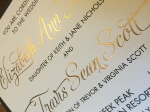
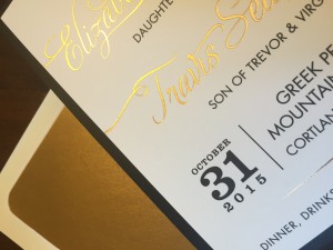
One of my favorite parts of this whole wedding business is, of course, the wedding invitations! My fiancé and I thought long and hard, talking through several options, before deciding on the color scheme of black + white, with hints of gold. It fit with our date (Halloween 2015) and our current design aesthetic (almost everything in our apartment is a shade of black, white, or grey).
Once I started working with these colors, the design seemed to just fall into place. I wanted to keep it really clean and simple, using a fun and unique font that would serve as the central design element. From there, I researched and found the best prices on the FABULOUS art deco pocketfold envelopes to complete the look.
THE DETAILS:
- All pieces were printed on 100 lb stratum ivory paper
- Thermography Black ink used for all text
- Gold foil stamped on Main Invitation
- Gold foil envelope liners used for outer envelope
- RSVP and outer envelopes had return addresses printed in Digital Offset Black ink
A closer look at the Gold Foil used on the main invitation:
 |
 |