The Task: Redesign a logo for Runner Clinic NYC.
Previous Logo: Russell Stram, Owner, Acupuncturist, and Physical Therapist, admittedly designed the original logo himself. Using elements of running, a red apple (symbolizing New York City – “The Big Apple”), which in then morphed into representing the red circle on the Japanese flag (his wife is from Japan, and Runner Clinic specializes in the “western” medicinal practice of acupuncture), this logo had A LOT going on. Although hearing explanation of his design process helped me understand each of the elements and how they were important to him, those messages wouldn’t be obvious to the average person.
Initial Logo: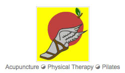
Redesigned Logo: I wanted to stay true to the elements important to his practice as much as possible. Updating the design treatment of the winged foot, I then included a skyline of New York City (including the iconic Empire State Building so it would be recognizable). In our initial rounds of edits I did have some versions that included a red Sun/Japanese circle, but ultimately it was nixed for a more simpler design treatment.
THE FINAL RESULT:
![]()
And just for fun, here’s a look at the Illustrator artboards that show the evolution of this design 🙂 :
![]()